HomeTrumpeter
Designing a Multi-Persona Property Management Platform
Role
Senior Product Designer
Industry
Real Estate
Duration
6 months

Project Overview
Home Trumpeters is a property management SaaS platform built for multiple user types operating inside one shared system. Property owners, tenants, administrators, vendors, field staff, and service providers all use the same platform but need completely different things from it.
I was brought in as the lead designer on a greenfield engagement. No existing design system, no established patterns, no prior designer. Just a product that needed to work for six different types of people without feeling like six different products.
Business Context + Problem Statement
Property management across North American and African markets runs on workarounds. Owners use spreadsheets. Tenants chase requests by text. Service providers get jobs through phone calls. There was no single platform holding all of it together.
The client needed one SaaS product that could handle operational workflows, financial management, maintenance coordination, analytics, AI-powered risk insights, and role-based permissions, all within one coherent system. The complexity was real: every user group interacted with the same underlying data but needed a completely different view of it.
The risk was building something that tried to serve everyone and ended up serving no one well.
Research + Discovery
I worked closely with founders and product stakeholders to map operational workflows for each persona before designing anything. Stakeholder interviews, role definition sessions, and journey mapping across all six user types.
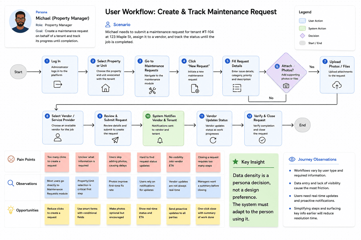
What the journey mapping exposed was the scale of the difference between personas. An administrator needed to see everything: transactions, user permissions, service requests, financial summaries, all at once. A tenant needed to see almost nothing: their unit, their requests, their payments. An owner needed a clear financial picture without the operational density that would overwhelm them.
The insight that shaped everything: data density is a persona decision, not a design preference. The same information architecture cannot serve all six users. The system needed to adapt to the person using it, not the other way around.
Strategic Opportunity + Design Challenge
The easy answer was building separate products for each user type. That was also the wrong answer. It would have created maintenance complexity for engineering, inconsistency across the platform, and a system that could not scale.
Three things shaped the design direction:
One system, six experiences. The platform needed a shared design language that could adapt contextually to each persona without fragmenting into separate products.
Density without overload. Admins needed everything visible. Owners needed clarity. Tenants needed simplicity. Designing for all three from one component library required building flexibility into the information architecture from day one.
AI that helps without overwhelming. The platform included AI-powered risk advisory tools for fintech integrations. The users acting on those alerts were not financial analysts. The design had to surface useful intelligence without exposing raw data people could not act on.
Design Approach + Leadership & Collaboration
As the sole designer on this engagement, I owned the project end-to-end. Discovery, information architecture, interaction design, component system, and production handoff across all screens.
I designed a role-based experience framework where each persona sees the platform shaped around their actual job. Navigation adapted to the user's role. Dashboards prioritized role-specific actions. Permissions shaped what was visible dynamically. The visual language stayed consistent across all of it.
Working closely with two developers and a product manager, I delivered wireframes, prototypes, and production-ready Figma files at every stage. I used Claude and UX Pilot throughout to pressure-test edge cases and move from rough ideas to stakeholder-ready work faster.
The question I kept coming back to at every decision point: does this screen show the right person the right information without making them wade through everything else?
Solution + Design System
The role-based navigation was the core of the solution. Each persona's view of the platform was shaped around their actual responsibilities. Admins got density. Owners got clarity. Tenants saw only what was relevant to them. Badge counters surfaced pending work without interrupting current flow. One consistent status badge system ran across all screens so the visual language held regardless of which persona was using the platform.
For executives and administrators, I designed KPI dashboards and data-dense analytics views where visual hierarchy was the only thing standing between the user and information overload. Per-property financial summaries, transaction histories, and occupancy pipelines all visible without opening nested views.
For the AI-powered risk advisory tools, the design showed three things: what the risk flag was, why it mattered in plain language, and what to do about it. No raw data dumps, no technical explanations. Just enough to make a confident decision and move forward. Fail-safe retry states handled the moments when fintech integrations timed out or returned incomplete results, keeping users in control even when the system failed.
The design system was built with Figma variables, design tokens, and Auto Layout from day one. The system gave the development team precise component specifications and enabled them to build with confidence across the full platform.


Impact + Key Learnings
The role-based navigation was the core of the solution. Each persona's view of the platform was shaped around their actual responsibilities. Admins got density. Owners got clarity. Tenants saw only what was relevant to them. Badge counters surfaced pending work without interrupting current flow. One consistent status badge system ran across all screens so the visual language held regardless of which persona was using the platform.
For executives and administrators, I designed KPI dashboards and data-dense analytics views where visual hierarchy was the only thing standing between the user and information overload. Per-property financial summaries, transaction histories, and occupancy pipelines all visible without opening nested views.
For the AI-powered risk advisory tools, the design showed three things: what the risk flag was, why it mattered in plain language, and what to do about it. No raw data dumps, no technical explanations. Just enough to make a confident decision and move forward. Fail-safe retry states handled the moments when fintech integrations timed out or returned incomplete results, keeping users in control even when the system failed.
The design system was built with Figma variables, design tokens, and Auto Layout from day one. The system gave the development team precise component specifications and enabled them to build with confidence across the full platform.

