Multi-Brand Ecommerce Platform
Designing a scalable ecommerce platform that businesses could use to launch branded online stores without rebuilding the shopping experience from scratch.
Role
Sr. UX Designer
Industry
Ecommerce, Retail
Duration
4 months

Project Overview
This project wasn't about designing a single ecommerce website. It was about building the experience behind multiple ecommerce websites.
The company owned the platform, and businesses could use it to launch branded online stores that matched their products and identity while sharing the same underlying shopping experience.
As the UX/UI Designer, I focused on the customer experience across the platform. I designed key parts of the shopping journey, including navigation, search, homepage layouts, category pages, product discovery, and reusable components that supported multiple brands without creating separate experiences for each one.
Business Context + Problem Statement
The platform needed to work for very different businesses while still feeling familiar to customers.
Every business wanted its storefront to reflect its own brand, products, and marketing, but rebuilding the shopping experience for every client wasn't sustainable.
Customers also faced another challenge. Many of the products sold through the platform included technical specifications, compatibility requirements, and multiple configuration options. Finding the right product often required understanding terminology that wasn't familiar to most shoppers.
The challenge was creating an experience that businesses could make their own without forcing customers to learn a new shopping experience every time they visited a different store.
Research + Discovery
Before designing solutions, I wanted to understand where customers struggled and what the business needed to scale.
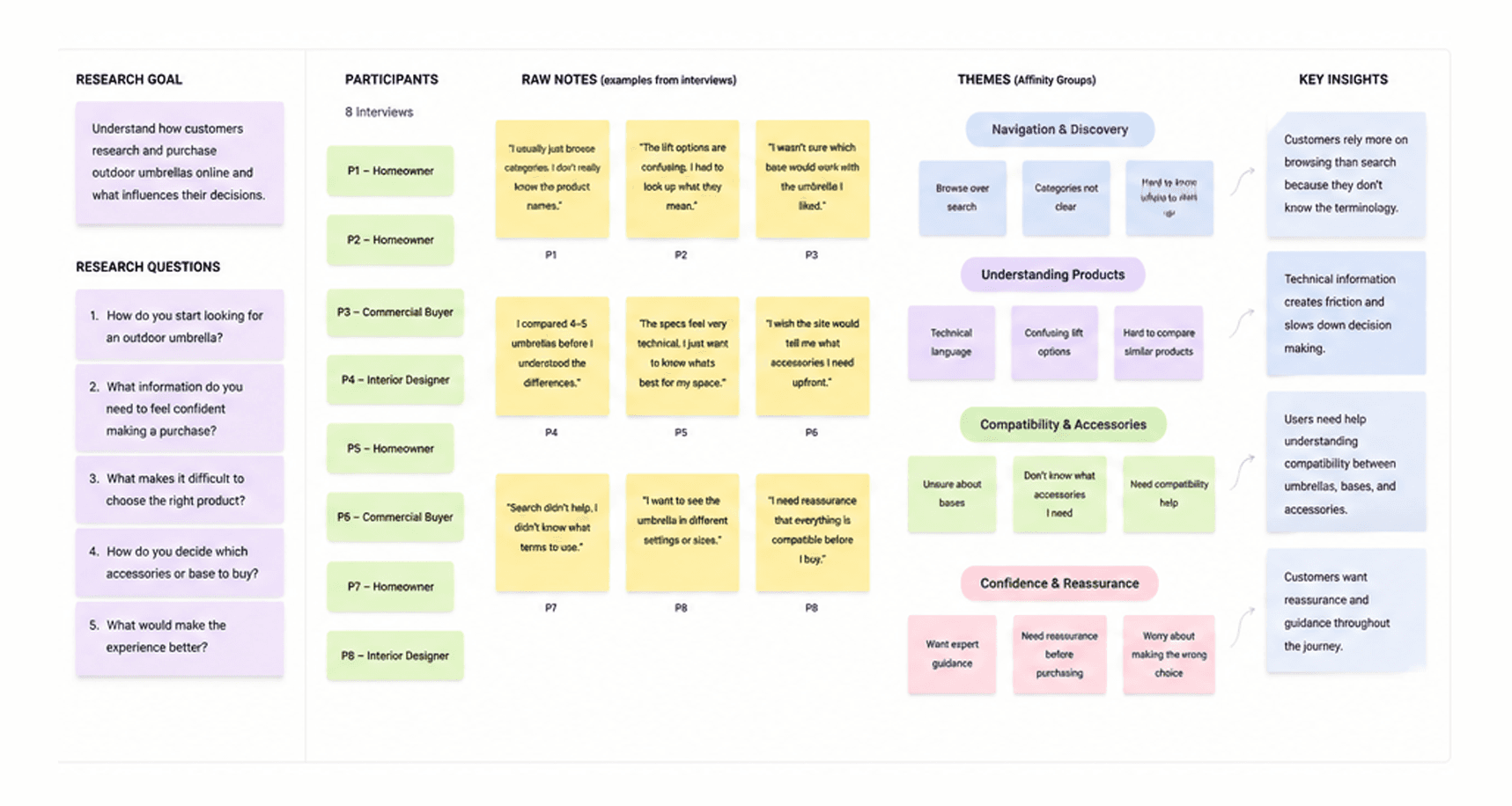
I reviewed analytics, conducted competitive analysis, participated in stakeholder interviews, and spoke with users to understand how people searched for products and where they encountered friction.
One thing became clear fairly quickly.
Customers didn't think the way product catalogs were organized.
They weren't searching with technical product names. They were trying to answer practical questions like:
"Which product is right for me?"
"What's the difference between these options?"
"Will this work with what I already have?"
That insight influenced much of my work on navigation, category organization, filtering, and product pages.
Strategic Opportunity + Design Challenge
There were two problems to solve at the same time.
The first was designing an experience that businesses could adapt to their own branding without changing how customers moved through the platform.
The second was making technical product information easier to understand without removing details customers actually needed before making a purchase.
On top of that, requirements shifted throughout the project, so every design decision needed to be flexible enough to evolve without creating inconsistencies across the platform.
Design Approach + Research Synthesis
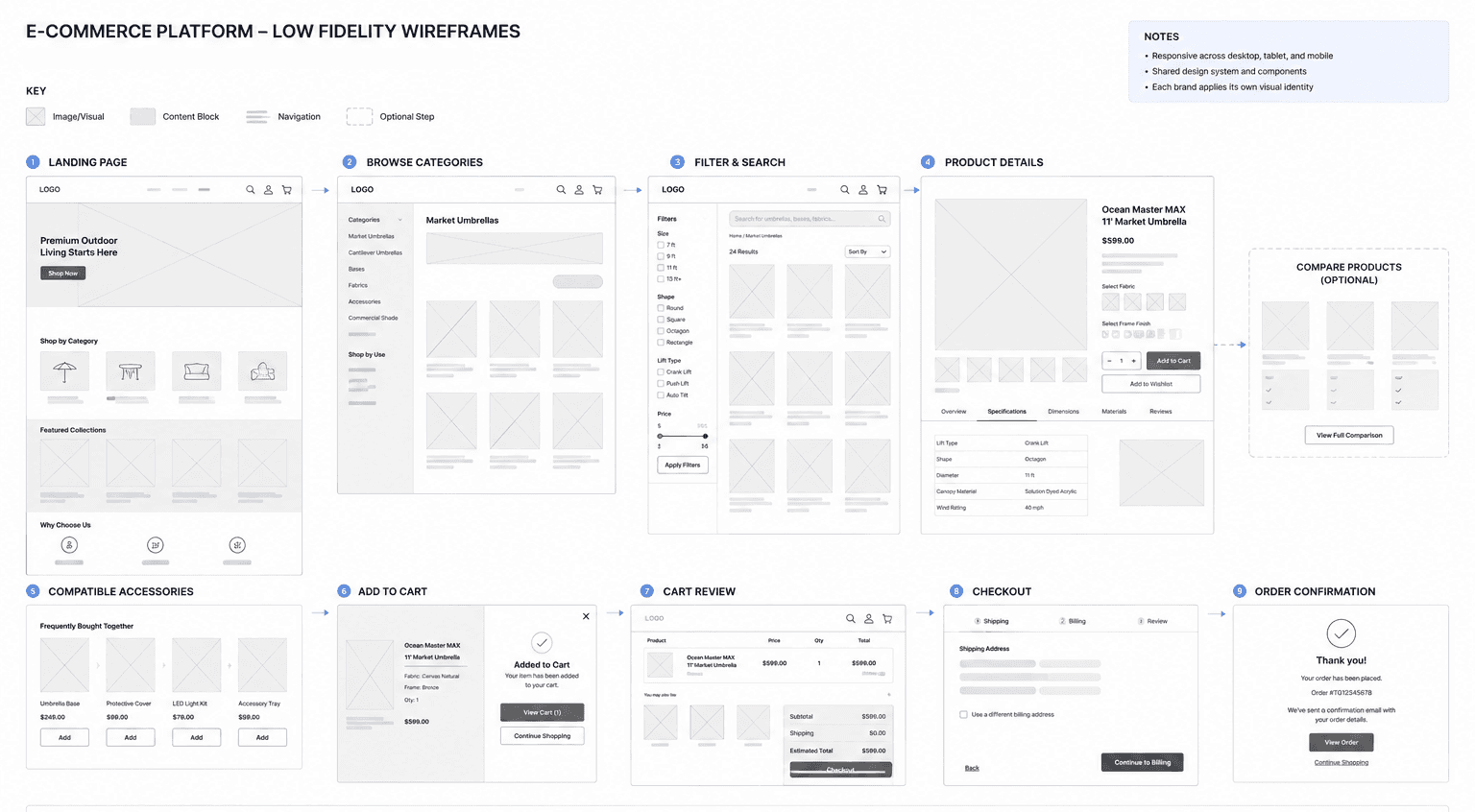
I focused on making product discovery feel more natural from the moment someone landed on the site.
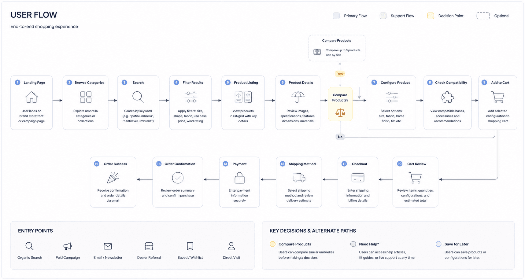
I redesigned navigation to better reflect how customers browse instead of how products were organized internally. I simplified category structures, refined search and filtering, and helped organize technical information into sections that were easier to scan and compare.
Another part of my work was contributing to the shared design system that powered every storefront built on the platform.
Rather than designing unique interfaces for each business, I designed reusable patterns that could be branded differently while keeping the shopping experience consistent. Navigation, promotional sections, product cards, filters, and responsive layouts all became reusable building blocks that could support future storefronts with minimal redesign.
Because priorities changed throughout the project, I stayed closely aligned with product managers and engineers to ensure updates could be incorporated without introducing unnecessary complexity or inconsistencies.
Solution + Design Execution
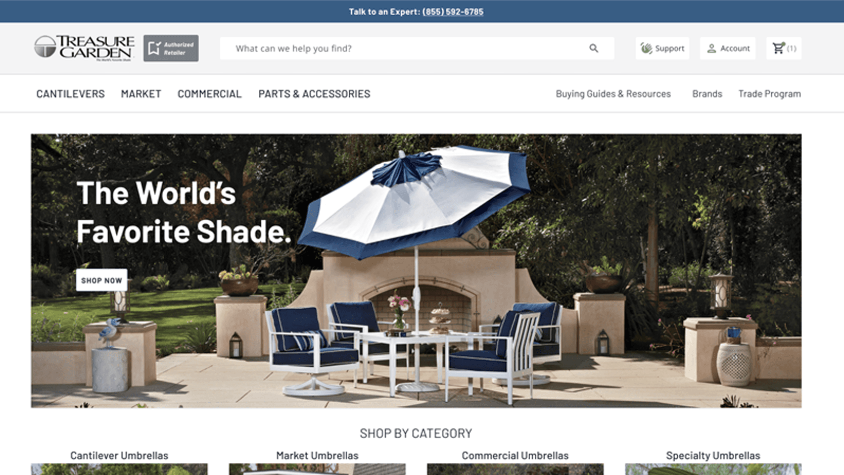
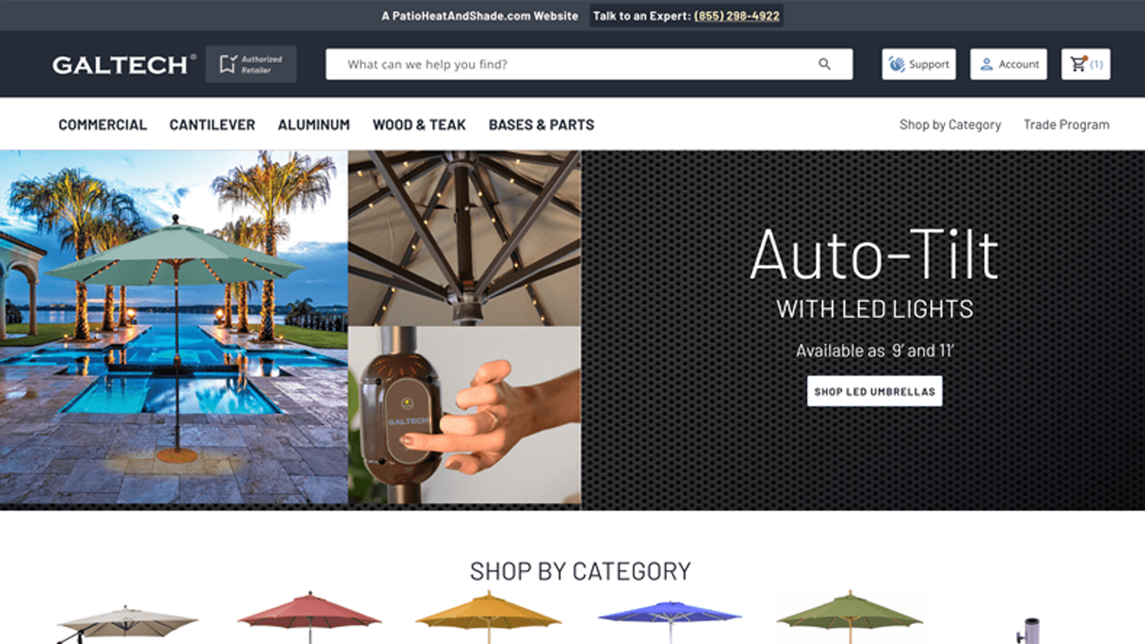
The final experience gave businesses the flexibility to create branded storefronts while keeping the customer experience familiar across every site built on the platform.
Customers could browse products more easily, understand technical information without feeling overwhelmed, and move through the shopping journey with greater confidence. The same navigation structure, component library, and interaction patterns powered both storefronts while each brand maintained its own visual identity, typography, and product focus.
For the business, reusable components and shared interaction patterns reduced repeated design work and created a stronger foundation for future storefronts.
Impact + Key Learnings
This project changed the way I think about designing platforms.
You're rarely designing for one business or one website. You're designing a system that needs to work for many businesses with different goals while still feeling consistent to the people using it.
It also reinforced something I still think about today.
Good ecommerce isn't just about helping people buy products. It's about helping them make decisions.
When navigation, product information, and comparisons are designed well, customers spend less time figuring out how the site works and more time deciding what's right for them.
Other projects

Healthcare Benefits Enrollment Platform
14 million people make healthcare decisions on this platform every year. Most were completing enrollment without understanding what they had chosen. Redesigned the entire experience from research through design system to fix that.

Property Management Platform
Designed a role-based SaaS platform serving six user types across two markets. Built complex operational dashboards, data-intensive workflows, and a scalable design system from scratch.
CVS ExtraCare Plus Deals Redesign
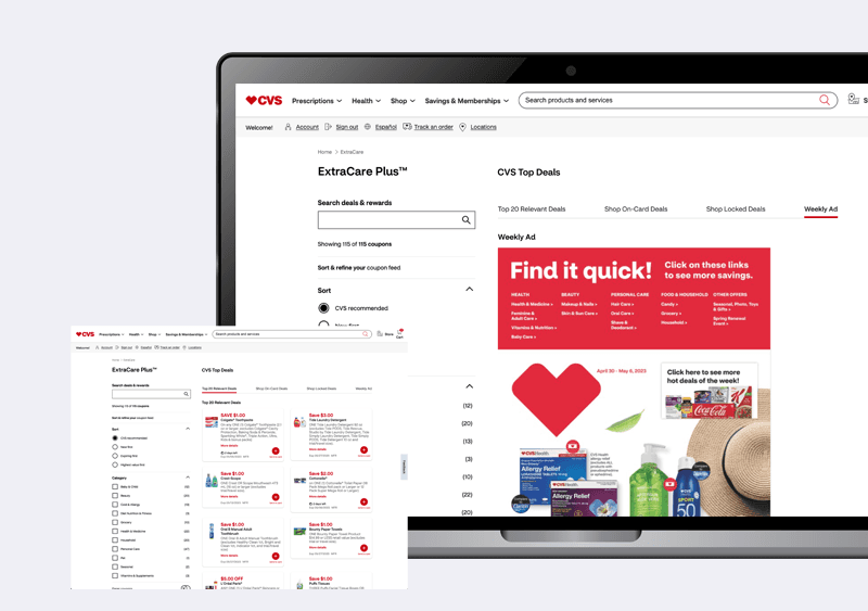
Redesigned the CVS ExtraCare Plus deals experience to make coupon discovery faster, filtering clearer, and the foundation scalable for future growth.

College Aid Pro
Completion time down 60%. Submission rates up 45%. Support contacts down 80%. The numbers came from fixing one thing: users never knew where they were or what came next.