Selerix Benefits Enrollment
A benefits administration platform handling healthcare enrollment, HSA contributions, and ACA compliance for 14 million users annually across the United States.
Role
Senior UX Designer
Industry
SaaS, HR technology
Duration
5 months

Overview
Selerix is a benefits enrollment platform used by employers and employees across the United States. The platform handles healthcare enrollment, HSA contributions, payroll deductions, and dependent management for over 14 million users annually.
When I joined, the product had no design system, inconsistent navigation, poor information hierarchy, and almost no visibility into healthcare costs during enrollment. Users completed enrollment without understanding what they selected.
Business Context + Problem Statement
Selerix powers benefits enrollment for over 14 million employees annually across the United States. Because enrollment directly influences healthcare coverage, payroll deductions, and out-of-pocket costs, employees needed an experience that was clear, guided, and financially transparent.
The existing platform made that nearly impossible. Employees navigated a 20-year-old system with no progress tracking, inconsistent layouts across benefit categories, and no cost visibility until the final summary screen. HSA contribution decisions required financial literacy most employees should not need for a basic enrollment task. Support ticket volume was high, and many users simply repeated prior year selections because they did not understand their options.
The business consequences were significant. HR teams and brokers fielded high volumes of calls just to get employees through enrollment. The platform had no design system, no accessibility governance, and no shared component library, creating friction for engineering on every release cycle.
The goal was to redesign the enrollment experience end-to-end: reduce cognitive overload, surface costs at every decision point, and build a scalable design foundation the team could maintain and extend.
Research + Discovery
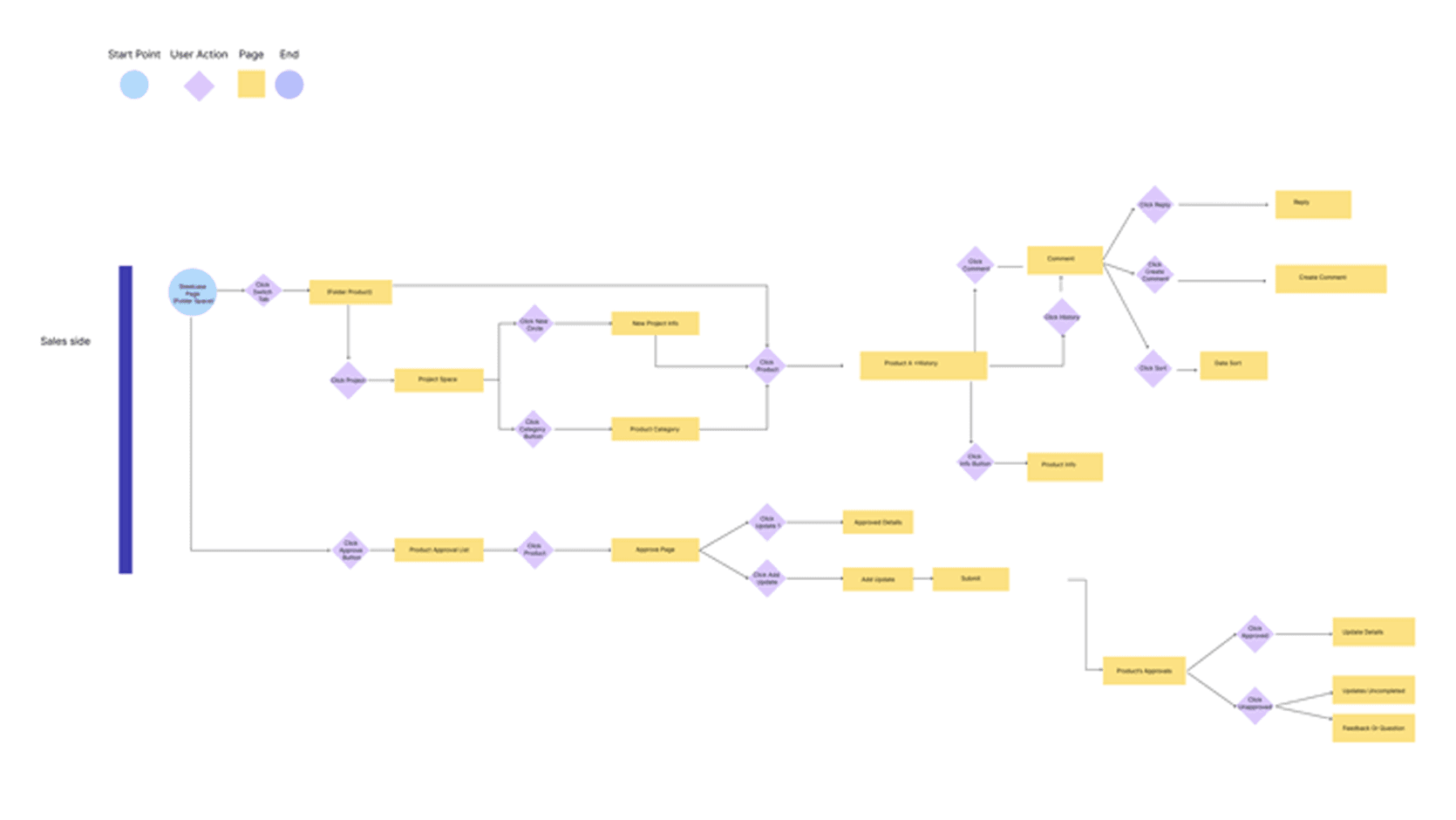
I started with support ticket analysis, stakeholder interviews, workflow mapping, enrollment flow audits, and heuristic evaluations
One major insight emerged quickly:
Users were technically completing enrollment, but many did not understand what they had selected or how much it would cost them per paycheck.
The issue was not form length alone. It was lack of guidance, information hierarchy, and financial clarity.

Strategic Opportunity + Design Challenge
This was not a redesign for the sake of modernization. The platform had been running for two decades and millions of people depended on it every year to make decisions that directly affected their healthcare and their paychecks. The real opportunity was making that experience work the way it should have from the start.
The hard part was that benefits enrollment cannot be dumbed down. The complexity is real. Legally binding decisions, compliance requirements, financial calculations. You cannot design those away. The job was making it feel manageable without stripping out what people actually needed to make good choices.
Three things shaped where I focused:
Where am I in this process. Employees had no way to track progress or know what was coming next. That had to change.
What is this going to cost me. Costs were hidden until the very end. Every decision point needed a number attached to it.
What should I put in my HSA. This was the biggest source of confusion. Employees should not need to understand actuarial math to make a contribution decision.
The goal was not a cleaner version of what already existed. It was an enrollment experience where employees finished knowing exactly what they had chosen and why.
Design Approach + Leadership & Collaboration
As the sole designer on this engagement, I was responsible for shaping the experience strategy and ensuring the redesigned platform worked for employees making high-stakes healthcare decisions once a year.
I framed the redesign around a single principle: users should always know where they are, what things cost, and what comes next. Research had shown the problem was not form length. It was the absence of structure, cost transparency, and financial guidance at the moment decisions were being made.
To guide the work, I focused on three questions:
How might we give employees a clear sense of progress and completion throughout enrollment?
How might we make healthcare costs visible at every decision point, not just the final summary?
How might we simplify HSA contribution decisions without requiring financial literacy?
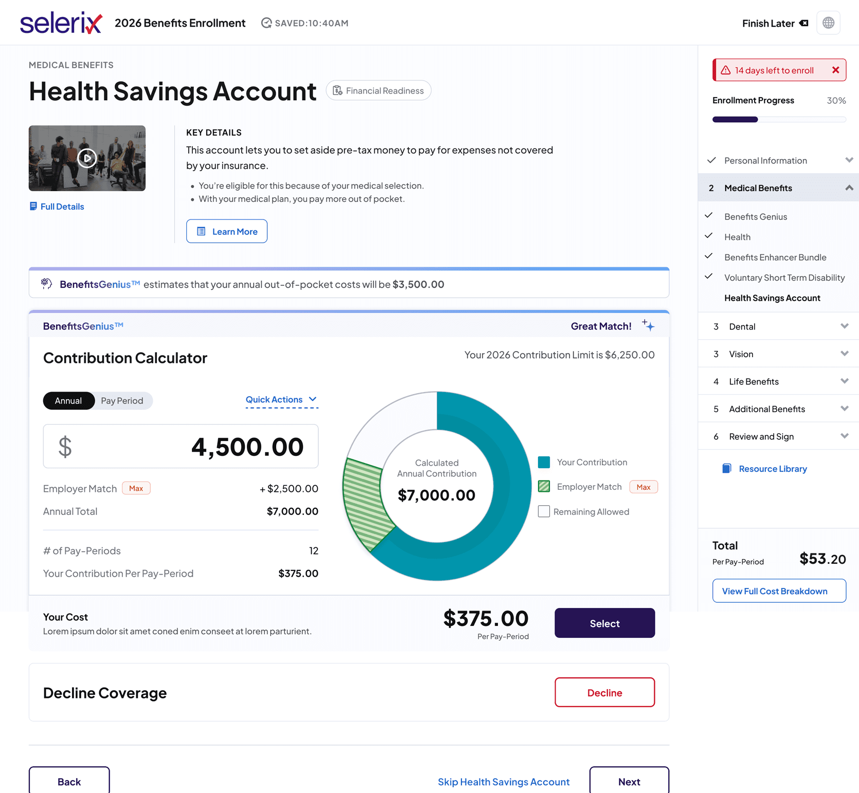
Working closely with product managers, engineers, and compliance stakeholders, I delivered workflow maps, wireframes, and high-fidelity prototypes in Figma to validate solutions before development began. Key solutions included a persistent progress sidebar, standardized layouts across all six benefit categories, and per-pay-period cost visibility throughout the flow.
For HSA contributions specifically, the team developed a real-time calculator embedded directly in the enrollment step. Type a contribution and instantly see employer match, annual total, and per-paycheck cost update live. What had been one of the most confusing steps in enrollment became one of the clearest.
Solution + Design System
The redesigned enrollment experience gave employees three things the old platform never did: a clear sense of progress, cost visibility at every step, and guidance exactly when they needed it.

A persistent sidebar tracked completion across all six benefit categories throughout enrollment. Costs showed per pay period at every decision point, not just the final screen. No surprises at the end.
For HSA contributions, the team built a real-time calculator directly into the enrollment flow. Type a number and instantly see employer match, annual total, and per-paycheck cost update live. The most confusing step became one of the clearest.
Accessibility was not an afterthought. WCAG 2.1 AA compliance was built into every component from the start, covering focus states, color contrast, screen reader compatibility, and touch targets. For a platform used by millions of employees across varying abilities and devices, that was not optional.
Underpinning all of it was a design system built from scratch. Tokens, variables, Auto Layout, every interaction state documented. It gave engineering precise specs, removed handoff ambiguity, and cut QA cycles by 75%.
Impact + Key Learnings
The redesign did what it needed to do. Support burden dropped, employees could finish enrollment actually understanding what they had chosen, and the team had a design foundation they could build on after I left.
The numbers back that up. QA cycles dropped 75%. Support tickets related to HSA decisions fell after launch. The platform went from no shared system to a fully documented component library with WCAG 2.1 AA built into every component, across desktop and mobile.
Three things I carry out of this engagement.
Constraints are design inputs. The compliance requirements around cost disclosure were not limitations to work around. They were the brief. The regulation and the user need pointed in the same direction.
Clarity is not the same as simplicity. I could not strip out the complexity because employees genuinely needed the detail to make good choices. The job was making it navigable, not invisible.
Build the system first. Every screen that came after was faster to design, easier to hand off, and more consistent because the foundation existed before the features did. That 75% QA reduction did not happen by accident.

