CVS ExtraCare Plus Deals Redesign
Redesigned the CVS ExtraCare Plus deals experience to make coupon discovery faster, filtering clearer, and the foundation scalable for future growth.
Role
UX Designer
Industry
Retail Healthcare
Duration
3 months
Project Overview
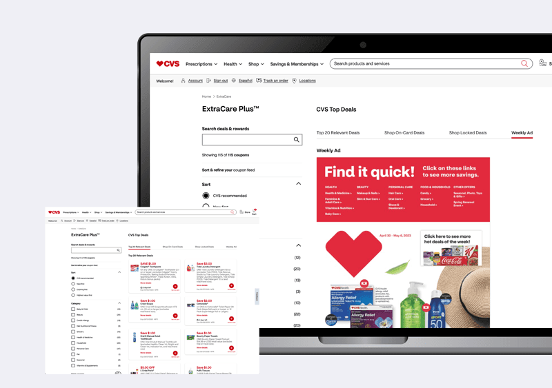
CVS wanted to modernize the ExtraCare Plus deals experience across web and mobile. The existing experience combined deals and rewards into one crowded interface that made it difficult for members to discover, filter, and save relevant offers. My role focused on redesigning the deals experience into a simpler, more scannable product that improved coupon discovery while creating a foundation for future growth.
Business Context + Problem Statement
The deals experience had become difficult to navigate. Deals and rewards lived in the same interface, coupon cards were hard to scan, filtering was limited, and users struggled to find offers relevant to them. The business needed a dedicated deals experience that improved discoverability without increasing complexity.
The platform did not have a content problem. It had a structure problem.
Research + Discovery
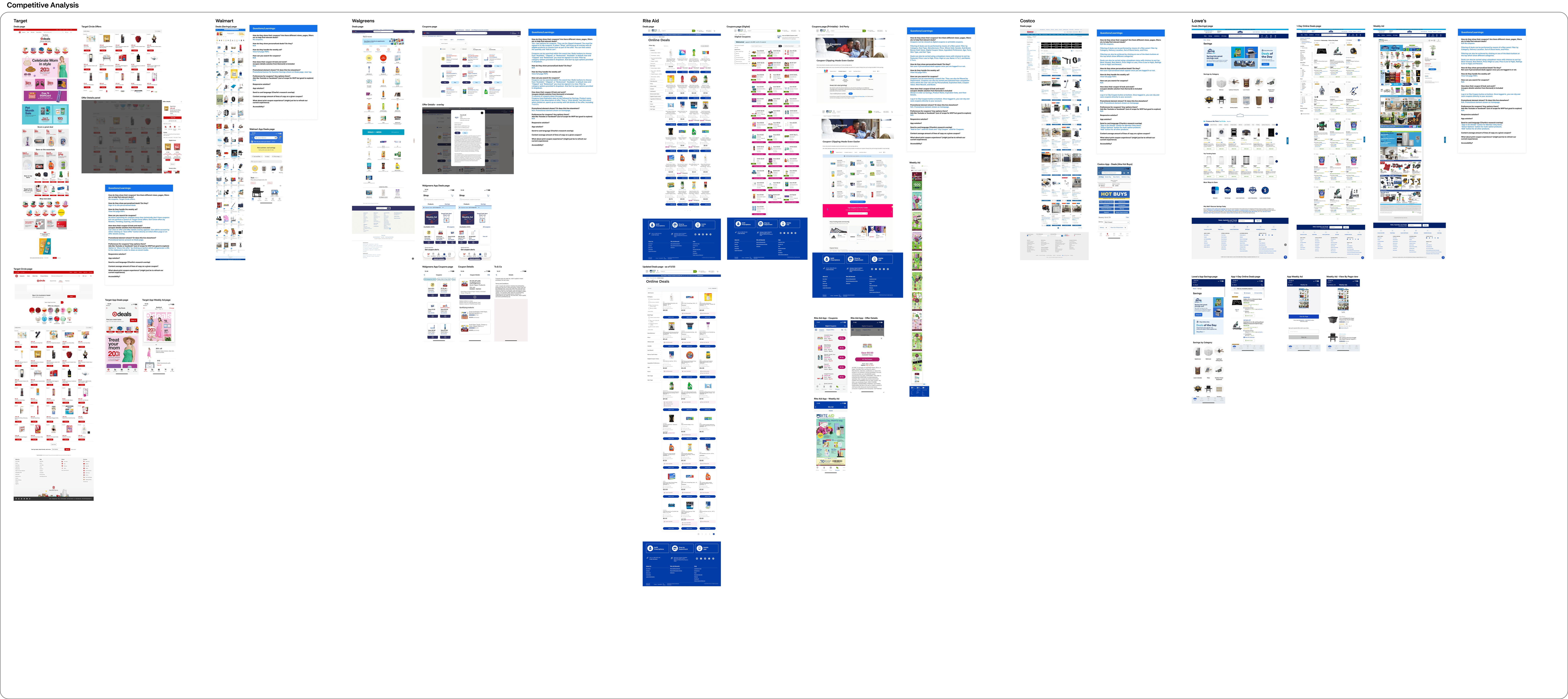
I started by benchmarking the experience against Walmart, Walgreens, Target, and Rite Aid to understand how leading retailers structured promotions and loyalty experiences. I focused on navigation, coupon presentation, filtering, sorting, and deal discovery to identify opportunities CVS could improve.
Key patterns that emerged:
Competitors with clearer category filtering had more scannable deal pages
Coupon card design directly affected how quickly users could assess and act on an offer
Tabbed navigation for deal types reduced cognitive load compared to mixed feeds
Sort options like expiring first and highest value first were expectations users already had
Strategic Opportunity + Design Challenge
Adding more features was not the answer. The platform already had everything. The challenge was making it feel like it was built for someone who had never done this before.
Three things shaped where I focused:
Where do I start. Families had no entry point. Everything was visible and nothing was prioritized. The platform needed to tell people what to do first.
What comes next. Progress was invisible. Families could not tell how far along they were or what was left. That uncertainty was driving the support contacts.
What does this number mean. Affordability data existed but families had to do their own interpretation. Net cost, sticker price, and SAI numbers sat next to each other with no context for what any of it meant for their specific situation.
Design Approach + Research Synthesis
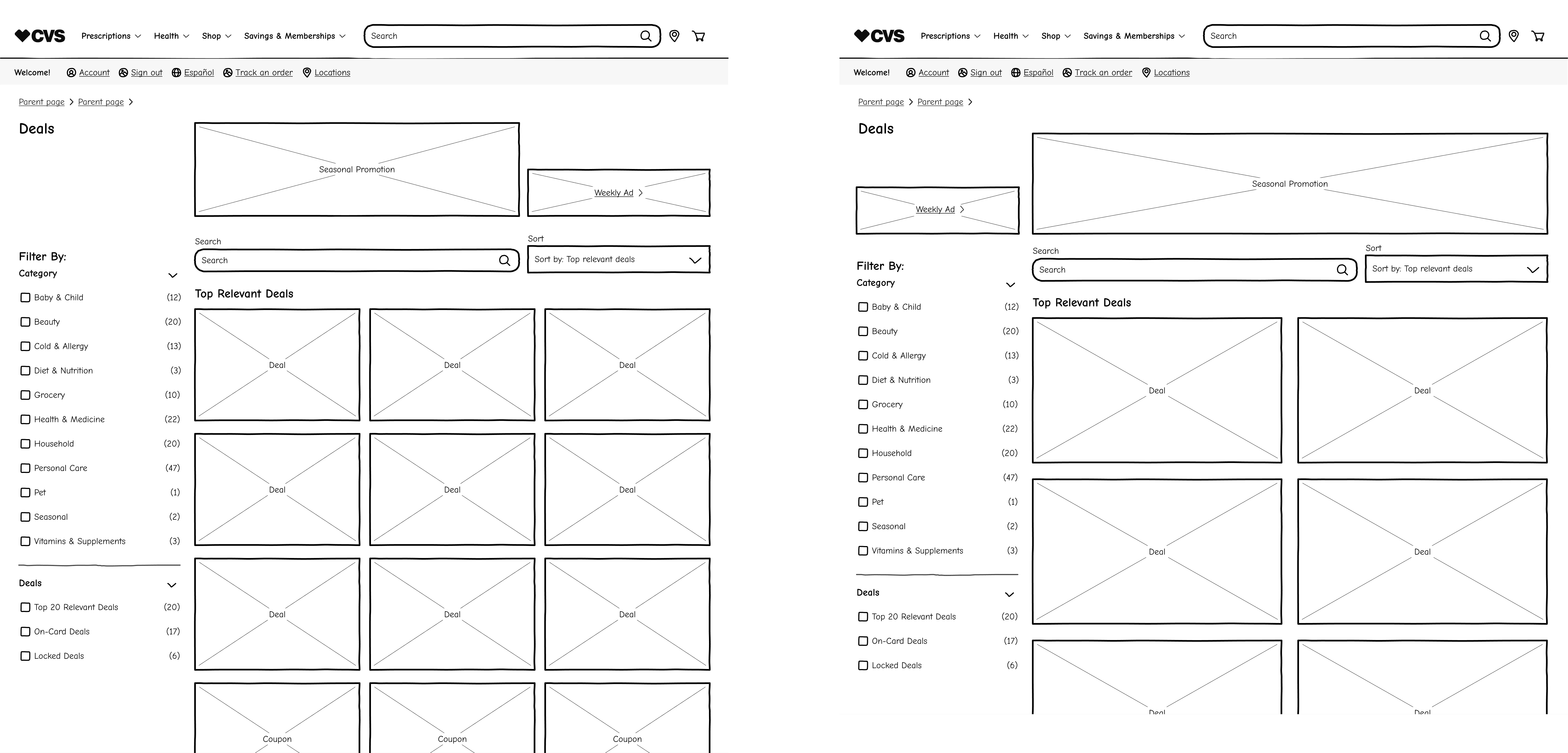
The work moved through several distinct phases. Paper sketches established the core layout thinking before any digital work began. Low-fi wireframes explored different approaches to the filtering panel, sort controls, coupon card structure, and tabbed navigation. Each iteration was reviewed with product partners before moving into usability testing, allowing us to validate interaction patterns early and reduce downstream design changes.
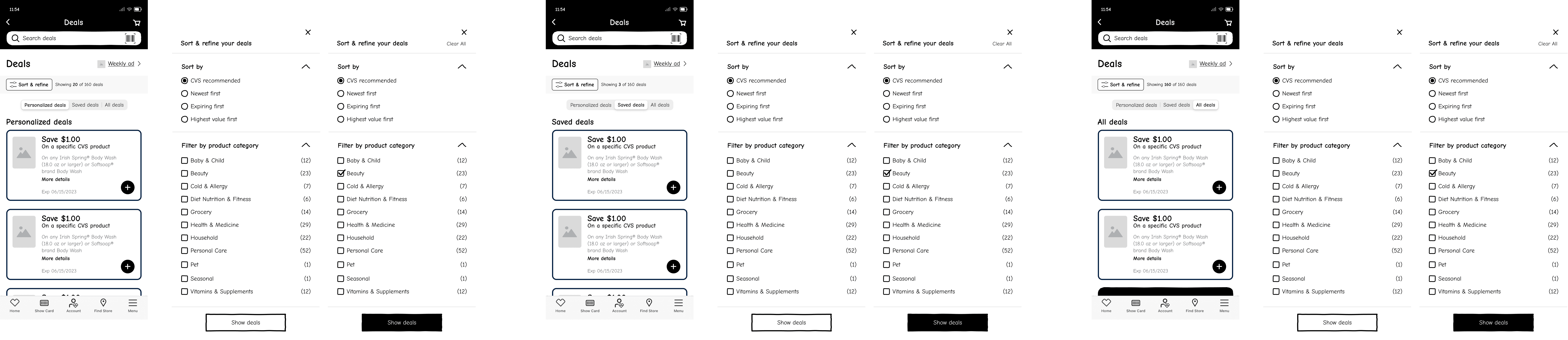
Two rounds of usability testing were conducted with end users. Each round tested different interaction models for sorting, filtering, and coupon card behavior. Test findings directly shaped the refinement phase, with specific layout and interaction decisions changed based on what users struggled with.
Solution + Design Execution
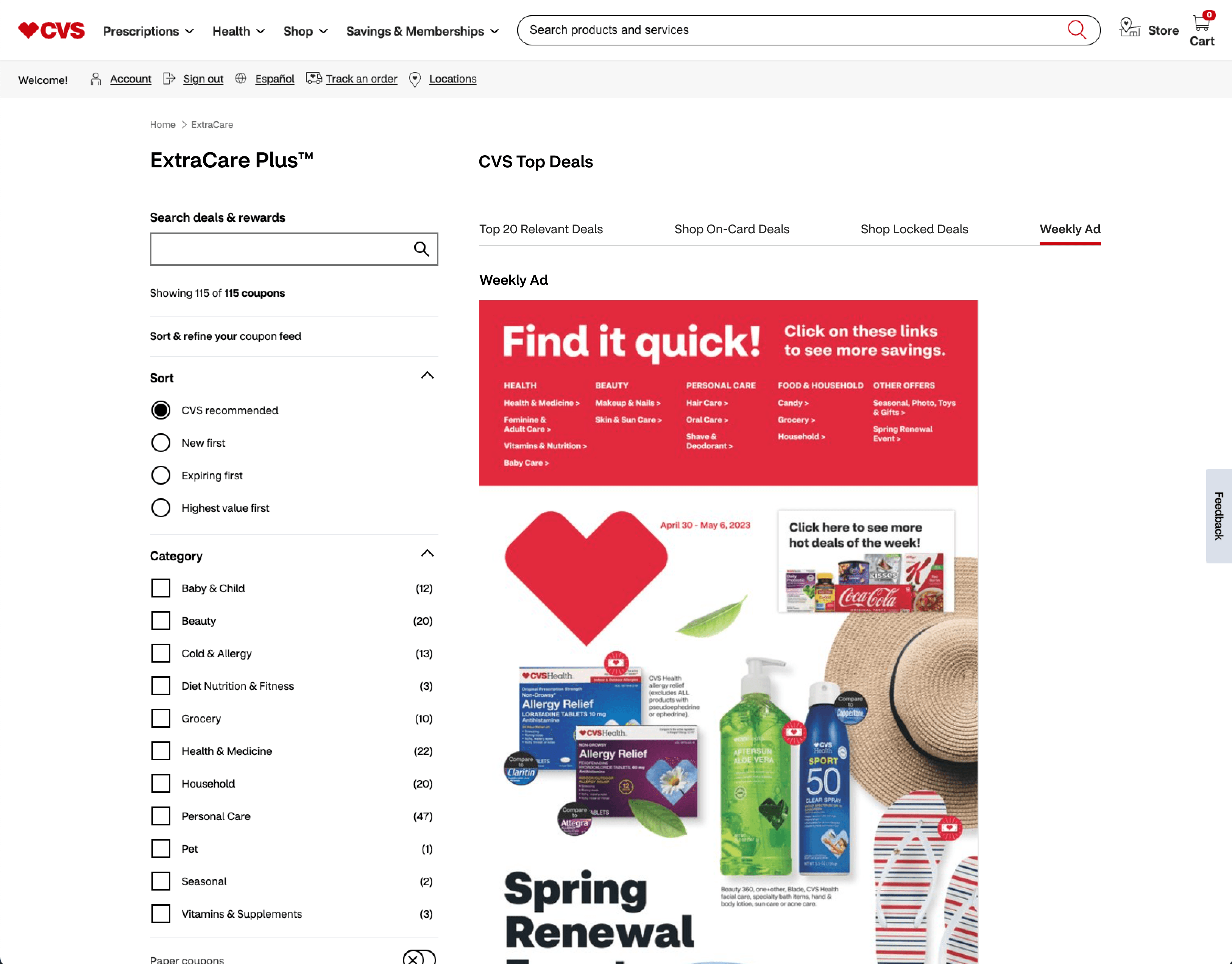
The final design separated deals from rewards into distinct pages. The deals page introduced tabbed navigation across Top 20 Relevant Deals, Shop On-Card Deals, Shop Locked Deals, and Weekly Ad. A persistent filter panel allowed members to refine results without losing their place in the browsing experience, reducing the need to restart searches after every interaction. Coupon cards were redesigned to surface deal value, product name, expiration, and send-to-card action clearly and quickly.

Impact + Key Learnings
The redesign created a clearer separation between browsing and loyalty management, making coupons easier to discover, compare, and save. The new structure also gave the product team a scalable foundation for expanding deal categories and merchandising strategies across both web and mobile experiences.
**This project was completed in 2022. Screens shown reflect the design at time of delivery and may not represent the current CVS platform
Other projects

Healthcare Benefits Enrollment Platform
14 million people make healthcare decisions on this platform every year. Most were completing enrollment without understanding what they had chosen. Redesigned the entire experience from research through design system to fix that.

Multi-Brand Ecommerce Platform
Designing a scalable ecommerce platform that businesses could use to launch branded online stores without rebuilding the shopping experience from scratch.

Property Management Platform
Designed a role-based SaaS platform serving six user types across two markets. Built complex operational dashboards, data-intensive workflows, and a scalable design system from scratch.

College Aid Pro
Completion time down 60%. Submission rates up 45%. Support contacts down 80%. The numbers came from fixing one thing: users never knew where they were or what came next.